Showing posts with label Planning. Show all posts

Sunday, 17 January 2010

Where I took the photos

I have taken my media photos in two different destinations, to provide different oppurtunities for lighting and scenery.

I took one set of photos in an apartment in Mexico. I originally meant to take some outside to make use of the sunshine, promoting how my artist is from these areas, but I did not like the way these photos turned out. I did like some of the photos which I took inside the apartment, however. This is the room which I took the photos in;


I chose to take photos in this room as it had cream walls, which is a versatile background which enables the model to stand out from the background. It also has large windows, letting alot of light in, giving the pictures good lighting.


I took a second lot of photos in the loft conversion of a house in England. The skylight window means alot of light is let in and like the Mexican appartment, the room has cream walls. The loft is roomy and a pleasant environment to work in. Therefore, when I decided I had to take some more photos, I made use of this room to take them.


The skylight lets alot of light in, which is reflected by the cream walls. This creates good lighting and the spacious room is easy to work in.

Photos


I have taken lots of photos, some of which I feel fit to use in my music magazine.


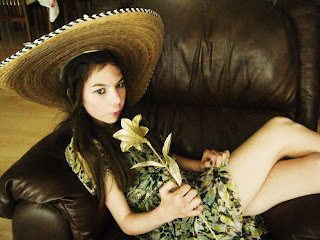
I really like this picture, I like Sophie's connection through the audience through her upward gaze and the use of the flower. However, I do not think the flower is clear enough and I regret not taking a photograph without the sombrero, as although it connotates her Hispanic style of music, I feel that she could look more mainstream and like an artist if she was not wearing it. Nonetheless, it is a potential front cover photo.


This photo is similar to the last one, but Sophie is sitting casually in a chair. I like this photo and am considering using it for the contents page. However, it is too similar to the other photo to use one for the contents page and one for the front cover. I will probably use this photo for the contents page and take another photo for the front cover.


I took this picture in a loft conversion, utilizing the cream wall to make Sophie stand out against the background, and not having a busy background. I really like this picture, especially Sophie's interaction with the audience through her unusual stare. This is definately a potential cover picture.


Although I like this picture, it has a "busier" background due to the cupboard and skylight window in the background. However , when I tried taking it from a different angle to avoid the busy background, the lighting was not as good. On the whole, I think I prefer the above image anyway in terms of Sophie's facial expression and posture.
This is a screenshot of just some of the photos I took- I took over 300 overall! Of course I could not upload all of them, so I had to do a major sort through of my photo collection.

Tuesday, 5 January 2010

Plans of Front Cover and Contents Page

I have drawn plans of my front page and contents.


Front Cover


Draft One of my Front Cover:


I first drew my front cover out like this, but it looked too crowded. So I decided to move the "Latino Loca" cover line and get rid of the text box which I had planned to surround some text. I also planned to move the headline left and shrink it a bit as I could not fit the whole title in!


Draft Two of my Front Cover:


I edited the front cover, but decided it still looked a bit crowded. Therefore, I decided to move the picture to the right and the cover lines to the left; this meant that I could have the cover lines down the left hand side and there could be less of them, meaning it would be less crowded. I could also enlarge the picture, which would reach out to the reader more.

Final Draft of Front Cover:


This is the final draft of my front cover. I definatley prefer the picture being on the left, and now have a clear idea how my photos and cover lines are going to fit together.


Contents Page

I found this alot easier to plan than the front cover, and was satisfied with my first draft.


I first wanted to have the picture on the left hand side, however, I altered this with the change of my front cover as it looked too simalar. I decided to put a picture in a circle in the middle so I can use text wrapping for each section of the contents. I decided to put a picture of my headphones on the right of the picture as it connotates music further.
I now feel much more confident about producing my front cover and contents page.

Thursday, 10 December 2009

Fonts for my Front Cover

Before deciding on my font, I am going to look at fonts already used on music magazine so I can get an idea of what is used and this will aid me to think of a unique and original font that also reaches out to the reader.


The red colour of the font is striking, whereas the title font is classic and effortless. It flows very easily from one letter to another, portraying the flow of music. The classic style conveys how music can be listened to by all ages, and is timeless. This is especially applicable to the magazine's genre as it focuses on popular chart songs.


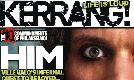
The KERRANG header is black, which bears a stark contrast to the white background. It is a basic font, conveying how music can be simple, and has a "shattered" effect. This illustrates how the music could have "shattered" the title, symbolising the power of music. The genre of music exoplored in Kerrang is rock, indie and alternative, which are the types of music which are said to "shatter windows" and hence, the text could be shattered easily.
Q magazine is shortened from "Q the music". The title is short and hence, needs to use colours which stands out. This is achieved through the white text and red background. It would look silly and over the top if the only letter of the title had fancy effects, so I think that they have done a good job with keeping the font classic and tidy.
NME stands for "New Musical Express". It is outlined by white and black, emphasizing how the title needs to stand out. The converse range of colours used contrast with one another, slightly clashing but in a good way, as if it is conveying the power and clash of music. The 3D font reaches out to the reader, as if it can be touched. This symbolizes the proximity of music to the reader.
Here are some fonts that I have tested on Indesign and Photoshop.


Out of these eight fonts, I have decided that I like the last one the best as it is a little bit different to the other ones. It reminds me of a stamp, which will look like it has been through a process of construction. This will engage the reader more, as it will look like someone has physically stamped the title on each magazine, conveying the hard work which has gone into the magazine. I am also going to add an effect to the font, as it will show good use of Photoshop and will add more emphasis to the title "STRUCK", which will add to the music connotations.

The personal effect which I am using with the stamp format has been used with Kerrang;


A picture of Billie Joe Armstrong from Greenday has been "saftey-pinned" to the magazine front cover. This looks personal to the reader, as if it has been made just for them.

Tuesday, 8 December 2009

My model's test pictures

I have taken a few pictures of my model to test her image on the camera and see her camera compatibility.


Deciding my Music Magazine Name

I have narrowed the list of names down to a list of six and then I will ask people which they prefer with a survey.

Possible names and the reason justifying each
Alive - A symbol of the way the music makes one feel.
Avid- A word representing the eagerness towards the music and magazine.
Blaze- A synonym of fire, portraying the heat and power of music.
Coda- A musical term for the closing section of a movement.
Flash- A sudden and effective word representing impact and shock.
Struck- Has music connotations- the strike of a drum. A strong word with impact- the way I want the music magazine to be presented.


Possible Name and number of votes for each
Alive 2
Avid 2
Blaze 4
Coda 1
Flash 3
Struck 6


I asked 18 people which name they preferred out of the six possible names.
The results of my votes stated that STRUCK is the most popular name.
I am going to use this name as it is the one which was voted to stand out the most and I agree with the voters that it leaves the most impact and emphasis. It also has a musical link and is onomatopoeic. It leaves an impact on the reader, as it is a strong word with harsh constanant sounds.
This is vital for a music magazine, as the front cover needs to reach out to the audience and the name is a key factor in this. As this name was most popular with my friends who are people who would be in the target audience, I am opting for STRUCK as my name.

Magazine Possible Names

These are the possible names I have thought of to call my magazine:
Alive
Struck
Deception
Revolution
Blaze
Zest
Coda
Flash
Swing
Soar
Avid

What do I want on my music magazine?

I could write an article about “Music from Mexico”, as my possible model has
Mexican roots. To do this, I will have to achieve a stereotypically Mexican look, which the reader can recognize. I will have to use clothing, which is stereotypically Mexican, such as checked shirt, cowboy boots, denim and a sombrero. I have all these clothes so it will be no problem to dress my model up in these clothes. I feel that this will add a fresh, unique feel to the magazine. The sombrero could also be a useful prop to aid my photo shoot- the model could either be wearing it, holding it or have it propped up. The audience would recognize this as stereotypical Mexican or Latino clothing so this would be a connotation of the model’s nationality to them.

The Mexican / Latino theme could mean that I could use Latino Pop as a genre for my magazine. This is too narrow a topic for the whole magazine to focus on, so I will make pop / indie my main genre and write a one time article on Latino Pop and the influence my particular artist has had on the British public. Latino Pop is a music genre which interests me as I enjoy the Mexican influence and I feel that it enables the British public to learn about other cultures. Latino / Spanish artists that have broke through to the English market are Shakira, Ricky Martin and Enrique Inglesias. My artist will follow these artists from having albums and songs in the Spanish language to breaking through to the English Market. This is what I aim to focus on; her crossover to the English music market and new album and single.