
I have taken lots of photos, some of which I feel fit to use in my music magazine.

I really like this picture, I like Sophie's connection through the audience through her upward gaze and the use of the flower. However, I do not think the flower is clear enough and I regret not taking a photograph without the sombrero, as although it connotates her Hispanic style of music, I feel that she could look more mainstream and like an artist if she was not wearing it. Nonetheless, it is a potential front cover photo.
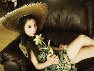 This photo is similar to the last one, but Sophie is sitting casually in a chair. I like this photo and am considering using it for the contents page. However, it is too similar to the other photo to use one for the contents page and one for the front cover. I will probably use this photo for the contents page and take another photo for the front cover.
I took this picture in a loft conversion, utilizing the cream wall to make Sophie stand out against the background, and not having a busy background. I really like this picture, especially Sophie's interaction with the audience through her unusual stare. This is definately a potential cover picture.

Although I like this picture, it has a "busier" background due to the cupboard and skylight window in the background. However , when I tried taking it from a different angle to avoid the busy background, the lighting was not as good. On the whole, I think I prefer the above image anyway in terms of Sophie's facial expression and posture.

This is a screenshot of just some of the photos I took- I took over 300 overall! Of course I could not upload all of them, so I had to do a major sort through of my photo collection.
No comments:
Post a Comment