Showing posts with label Research. Show all posts

Monday, 1 March 2010

Research and Analysis of Double Page Spreads

My first double page spread which I am looking at is My Chemical Romance from Kerrang Magazine; the same issue that I did the analysis of the front page.


This double page spread is dark, symbolizing the genre of music which My Chemical Romance is assosiated with. "Gothic" or "rock" music is associated with the darkness of night, so the darkness seems appropriate. The red and white represent a contrast to the dark background and black and white photos. The photos used are live action shots, conveying the power and energy of their performance. The picture of lead singer Gerad singing into the microphone has previously been used on the front cover, so the front cover and double page spread are connected in this way. The black and white photos convey mystery as not all is revealed, and are appropriate for the music genre; if they were a pop band, the photos should be expected to be in colour to mirror the music conveyed. The fact that the only colour on the page is red effectively conveys danger and warning. This illustrates how the band would want to be seen; dangerous. The article is small and all in the same colour, and starts with a big "M". Through my research I have found that the large letter at the start is conventional to music magazine. Therefore, I will use it on my double page spread. Although I cannot read the article, I can tell that it is reasonably short. This adds to the mystery promoted throughout the article, as it is wondered what the article is conveying. The title "we're being the best MCR we can be", suggests that they are one of a kind, which is supported further through the images.


The band is successfully conveyed as a rock/metal band, which is their image. However, I will not be taking many conventions from this page to use on my own magazine as my singer does not share the same features, nor is part of the rock music genre.


The next double page I am looking at is an interview with the band Razorlight, from "Q" magazine.


This is probably not the first page of the interview; as there is no masthead. However, it is the only one I could find online. It depicts a picture of the whole band splashing through water, mise-en-scène effectively being used to convey them as fun loving, happy go lucky individuals. The water that they are going through conveys a type of danger, but they are overcoming this.


I have mainly analyzed the layout of double page spreads here, however, for my task I must also focus on the article behind the layout. Therefore, I have looked at some online interviews, as they are easily accessible, free and I can read them better than the pictures of magazines I have found on google images! Here are three that I particuarlly liked, and relate well to my singer:


Interview with Shakira


A star since the age of 13. The fourth richest woman in pop. Saviour of thousands of children. Oh, and a bit of an academic to boot. Is the Latino sensation Shakira just too good to be true?

It’s a sweltering night in the Bahamas and in a back room of a recording studio close to her home in an exclusive gated community, the belly-dancing Latino pop star Shakira is ripping the tinfoil wrapping off a rib of beef with almost indecent speed.
'Finally!’ she exclaims in her quick-fire Spanish-American accent, rolling her eyes to convey that she knows divas shouldn’t eat at all, let alone gnaw ravenously on ribs. 'I can only have meat once a week and today is beef day, so I’m happy. It’s this diet I’m doing; it’s pretty cruel. All fish and vegetables.’ But then her pouty face clouds over. 'But you’re not eating!


That makes me feel bad. Maybe I should eat later. And we need to turn the air-conditioning on, you’re melting! Not me. I’m like a mosquito, I love humidity. I don’t sweat.’ ............


FULL ARTICLE - http://www.telegraph.co.uk/culture/music/rockandpopfeatures/6122146/Shakira-interview.html

Sunday, 31 January 2010

Contents Page Research

I now need to analyze a contents page to explore the conventions of one so I can apply this to my own task.

Here is my analysation of a Q magazine contents page


Thursday, 10 December 2009

Fonts for my Front Cover

Before deciding on my font, I am going to look at fonts already used on music magazine so I can get an idea of what is used and this will aid me to think of a unique and original font that also reaches out to the reader.


The red colour of the font is striking, whereas the title font is classic and effortless. It flows very easily from one letter to another, portraying the flow of music. The classic style conveys how music can be listened to by all ages, and is timeless. This is especially applicable to the magazine's genre as it focuses on popular chart songs.


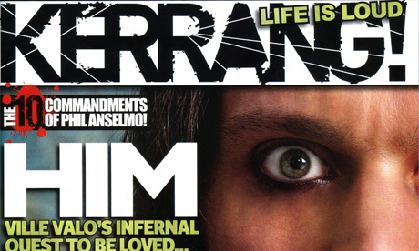
The KERRANG header is black, which bears a stark contrast to the white background. It is a basic font, conveying how music can be simple, and has a "shattered" effect. This illustrates how the music could have "shattered" the title, symbolising the power of music. The genre of music exoplored in Kerrang is rock, indie and alternative, which are the types of music which are said to "shatter windows" and hence, the text could be shattered easily.
Q magazine is shortened from "Q the music". The title is short and hence, needs to use colours which stands out. This is achieved through the white text and red background. It would look silly and over the top if the only letter of the title had fancy effects, so I think that they have done a good job with keeping the font classic and tidy.
NME stands for "New Musical Express". It is outlined by white and black, emphasizing how the title needs to stand out. The converse range of colours used contrast with one another, slightly clashing but in a good way, as if it is conveying the power and clash of music. The 3D font reaches out to the reader, as if it can be touched. This symbolizes the proximity of music to the reader.
Here are some fonts that I have tested on Indesign and Photoshop.


Out of these eight fonts, I have decided that I like the last one the best as it is a little bit different to the other ones. It reminds me of a stamp, which will look like it has been through a process of construction. This will engage the reader more, as it will look like someone has physically stamped the title on each magazine, conveying the hard work which has gone into the magazine. I am also going to add an effect to the font, as it will show good use of Photoshop and will add more emphasis to the title "STRUCK", which will add to the music connotations.

The personal effect which I am using with the stamp format has been used with Kerrang;


A picture of Billie Joe Armstrong from Greenday has been "saftey-pinned" to the magazine front cover. This looks personal to the reader, as if it has been made just for them.

Results of Survey

I have asked 10 friends my survey asking which music and music magazines they prefer. This has helped me to determine the genre I want to use.
I can conclude that the most popular genre was R&B with 8 votes, closely followed by indie with 7 votes. My magazine will hence spread over these two genres, featuring both R&B and indie artists. Rolling Stone and NME were the most popular magazines which people would buy, so I am going to closely follow and analyze these two magazine to obtain inspiration for my magazine. I am going to make my magazine a monthly magazine, as the majority of people said that they would not buy every issue weekly magazine and are more likely to buy a monthly magazine. This will cause my price to rise as there will be more content in the magazine. However, it also means that people would be more inclined to buy every issue so it could attract fans of the magazine. The majority of voters said that they are impartial to the gender of the magazine photo, however more opted for a girl on the front cover than a boy. I will use a girl for my front cover of my music magazine.

Rolling Stone Music Magazine Analysis


After looking at various magazine covers, I have decided to use Rolling Stone as the main inspiration for my music magazine. I am researching this magazine because it has featured artists with the same type of genre as I am using and the results of my survey stated that Rolling Stone was the most popular magazine which my proposed target audience would buy. Shakira is an inspiration for my genre and the look which I want my artist to have, and she has been featured on the Rolling Stone front cover. I want to have a wide target audience of people who listen to all types of music so will have to feature articles about alot of different music. This is a front cover featuring Shakira, who is my main inspiration for my artist.
It features a mid-shot of Shakira, confidently walking towards the camera. She has a thumb in her belt, a body action suggesting confidence. This compliments the title "Can Shakira Conquer the World?". She shows confidence by her body actions and she engages with the audience by making eye contact. Her black outfit connotates a superhero, as the colour suggests ability to blend into the background, or the shadows which is a superhero quality. This agrees with the cover line "Can Shakira Conquer the World?".
Shakira is pictured as a confident and talented woman, the same way which I want my artist to be conveyed.

Tuesday, 8 December 2009

My Inspiration

Latino artists have inspired my music magazine; the most famous being Ricky Martin, Enrique Inglesias and Shakira. As Shakira is female and so is my model, she is my main inspiration for my model.


Shakira's wavy, carefree hair and dark eye make up have inspired me. I particuarly like the photo of her with the ring of fire. This represents heat and danger, two exciting factors which are likely to interest and engage a reader of a music magazine. Her gold and black clothing accenulate and complement her colouring. She looks exotic and interesting as she is different from alot of artists.


I have researched her music to make sure that it is definatley the kind of music I want portrayed in my music magazine.

Although she broke through to the music market with "whenever, wherever", her first really famous song was "hips don't lie", which topped charts in 55 countries. By hearing this song, I can hear the latino influence, and it is known as a "Latin Pop" song which is what I want in my artist.

It is summery and happy, both traits that I want my artist to follow.


Here is the song :


I have also looked into Shakira's less famous, all Spanish songs. Her most recent album "She Wolf" came out in conjunction with a spanish album, titled "Loba". I have researched this album and found the title track, "Loba", in Spanish. I want my artist to have previously sung songs like these, in Spanish, and now be ready to break into the UK music market.

My artist will therefore be following the same lines that Shakira did, and this will make intresting points of discussion in the interview.

Research into my target audience


I am going to ask 10 friends who are ages 14-18 a survey about which music magazine they prefer. This will enable me to create a magazine bases on a theme and genre that my target audience is likely to enjoy.

This is my survey:


This is a sample of how my survey was answered:


This is the results of my survey (print screened from an excel document)


According to the results, I can see that the most popular genres of music were R&B and Indie. Rolling stone is the most popular music magazine, whilst music magazines are most frequently purchased in the 1-4 week bracket. Most people have opted for either a boy or a girl on the front cover, but a girl featuring is proved to be more popular than a boy. Therefore, I will have a girl featured on my front cover. My magazine will be indie/ R&B themed and will be a monthly edition. I am also going to closely analyze Rolling Stone, so I can produce a magazine which will draw in many readers.


Research into Latino artists


Ricky Martin
Ricky Martin rose to fame as a member of Menudo, a Latin Boy Band and since 1991 has been a solo artist. He is from San Juan in Puerto Rico. He first started acting in New York City and then progressed to releasing his first solo album in Spanish, which was self titled. His biggest single off this album was “Fuego Contra Fuego”, meaning “Fire against Fire”. His music centered around traditional Latin sounds, and he produced three more Spanish albums, called “Me Amarás” (love me) and “A Medio Vivir” (Medium Life). He then crossed over the English music market, preparing his first English album in 1999. This was self-titled and featured the single “Livin’ Le Vida Loca”, which is his most prominent single. Another single, “She’s all I ever had”, peaked at number 2 on The Billboard Hot 100. Sound Loaded was his second released album, featuring “She Bangs” and a duet with Christina Aguilera. Since, he released more Spanish albums including a greatest hits; “La Historia” (The story) which stayed at number one of the Latino charts for six weeks. His last English Album was released in 2005, called “Life”. He has a forthcoming 11th album, which will feature songs in both English and Spanish. He is also planning to release a book.

Enrique Inglesias
Enrique Inglesias is a Spanish singer, starting his career with Mexican indie label Fonovisa that evolved him into one of the most popular artists in Latin American and the Latino market in the USA. He at first produced Spanish tracks and albums, such as his 1997 album Vivir, meaning life in Spanish. He then produced the album Cosas del Amor (things of love). He then crossed over into the English language music market, producing songs such as Hero and Do You Know. He still uses Spanish music as an influence and has had a great impact in Spanish speaking countries. He represents Spanish and Latin influence on the country.


Shakira
Shakira, a Columbian singer, is a major representative of the genre Latin Pop today. Her recent singles include “She Wolf” and “Did It Again” all which feature a Latino influence in the music or lyrics. Her music features an exotic feel which draws in the listener and the different edge to her songs make them catchy and easy to listen to. She has been a member of the music scene since she was only 13 years old with the debut album Magia. She was played on Columbian radio a lot and her music video for first single ”Magia” became the first national pop video in Columbia. Since her first album, which was a success in Columbia and invited her to progress her style of music, she has had many singles such as “Whenever, Wherever”, “Hips Don’t Lie”, “She Wolf” and “Did it Again”. Her influences have been partially oriental music, such as the Bollywood theme for her performance of “Hips Don’t Lie” at the 2006 MTV Video Music Awards. She also uses South American Folk Music, combining different cultures with British Pop to make her Latino music accessible to the British public.
Shakira is the most well known Columbian artist and provides us with accessibility to South American culture through her music.

NME Magazine History

NME magazine, or New Musical Express, has been published weekly since March 1952, although it has been criticized and faced closure in several instances. It was the first paper to have a singles chart and was also named the best selling British music magazine. It’s pinnacle was in the 1970’s when it featured Punk Music under the editors Tony Parsons and Julie Burchill.

In the 1960’s, a decade after the magazine’s first edition, the Beatles and the Rolling stones were featured on the front cover. They were the major rock bands of this time and represented a change of music- The Beatles covered a special genre which had not been used before. Using these popular bands ensured that many people bought the magazine to read about them.

The 1970’s resulted in the change of genre of which the magazine focused on. Punk music was a new craze in England and although NME was at first skeptical about using this new genre but with the employment of Julie Burchill and Tony Parsons a new image for NME was created. Bands such as the Sex Pistols were often featured on this new look magazine.

As the UK music scene developed, NME’s image did aswell. By the 1980’s the magazine staff were split between writing about hip hop and rock music. Sales proved to be lower when hip hop acts were on the front cover, and as this was often sales officially declined. Articles which were unrelated to music began to be featured as an attempt to boost sales.

The Madchester scene was introduced in the 1990’s. This covered new British indie Bands and also Grunge bands from the USA such as Nirvana and Pearl Jam, however, NME only sparked a great interest in these bands when Nevermind became popular. The magazine started to be dominated by American bands but still featured some British Indie Bands. Blur and Oasis, two popular Britpop bands were often featured, which increased NME’s sales and NME started using Britpop as a genre for the magazine to base itself on. However, with the decline of Britpop the magazine was again left directionless. It attempted to embrace DJ culture of the 1990’s but sales decreased and they were criticized for not supporting rock and indie music.

A change of design was needed; this resulted in the redesign of the magazine to a full tabloid size with full glossy colour covers.

At the start of the new millennium NME triumphed over Melody Maker, which was discontinued and merged with NME. The magazine attempted to broaden it’s coverage by using hip hop acts such as Jay-Z and Missy Elliot, as well as R&B acts such as Destiny’s Child. These were soon dropped as they proved unpopular. In 2002 there was a change of focus as the magazine started to focus on bands such as The Libertines and The White Stripes. This was called by the band “The New Rock Revolution”. New British bands such as Bloc Party and the Kaiser Chiefs were also used, which was labeled as new “indie music”. However, using this resulted in a criticism for the magazine’s lack of diversity. This resulted in another re-design in May 2008 which aimed the magazine at older readers and had a less poppy feel. Coldplay were featured on the first edition of the re designed magazine.
The magazine now covers acts such as Kings of Leon, Green Day and The Killers, but has also used Lily Allen and a tribute to Micheal Jackson after his death earlier this year. It uses mostly the indie artists of today’s music scene.

NME’s sales have risen and declined throughout the years with the use of different acts. The magazine has constantly adapted to suit the musical preferences of the target audience at each
time.

research is mainly from the wikipedia page: http://en.wikipedia.org/wiki/NME

Kerrang Analysis

Kerrang Analysis


Which company produces the magazine?
The Bauer Media Group


What is the target audience according to the publisher's website?
13-20 year olds


How much does it cost?
£2.20


How often is it published?
Weekly


What is its circulation?
Approx 52000


Work out the approximate monthly revenue streams from advertising and circulation.
Circulation = 52,000 x £2.20 = £114,400
Advertising= £2999 per page
There are 17 pages of adverts
£2999 X 17 = £50,983

£114,400 + £50,983 = £165,383


What does this tell us?
This tells us that over double of the monthly revenue streams are made through circulation rather than advertising. The magazine relies more on the magazine selling than people wanting their products advertised.

Analysis of the Front Page


Title- why is it called that and what does the title connote?
The magazine is called "Kerrang". This makes use of onomatopoeia to imply the sound of music that would be discussed in the magazine. "Kerrang" connotates the sound of an electric guitar, which is an instrument often featured in the magazine.


Analyze the masthead/ title logo
The title is shattered and looks smashed, which agrees with the title "Kerrang"; it is almost as if the sound that the electric guitar which is a subject of onomatopoeia in the title has smashed the title due to its loudness. This introduces the genre of music that will be discussed throughout the magazine (probably rock and indie styles, and any music that can be played loud in order to smash the title. The typeface of the title suggests rebellion and outrage, agreeing with the cover lines on the front page, such as "My Chemical Romance... Rebelling" and "Green Day" causing "anarchy".


What is the main image?
Analyse the facial expression, direction of gaze, body language, clothing etc. How does this reach out to the reader?
The main image is a head shot of "rock icon" Dave Grohl. He is looking towards the camera with his head slightly turned. He is half smiling, baring his teeth. This draws in the reader as they want to see what is behind this unusual facial expression. He is wearing a black top which is quite plain but also mysterious. The fact that he is wearing black and his facial expression promote the reader to want to learn more about him due to the enigmatic effect that these features provide. Black is quite plain and the reader is intrested to discover what makes him contrary to this. Not alot is revealed by the main image, so people want to read in more. He is almost making eye contact with the reader which again, captures and reaches out towards the reader.


What other images appear on the front cover and why?
The other pictures are of a singer from Green Day, put there to introduce the "anarchy" article about them. The lead singer, Billie Joe Armstrong, is singing into a michrophone which introduces the article of Green Day. It appears to be fastened on with a picture of a paperclip, which gives a personal feel to the magazine. There is also a picture of My Chemical Romance (MCR) singer Gerard singing into a microphone, with his mouth wide open and face scrunched up, which is an action shot. together with the title "we're rebelling", the picture works to enforce the reader to wonder what MCR are doing as a rebellion. It also lnks with rock, and as it is an action shot of Gerard singing, the power of the music is conveyed through him.


Explain the connotations of typefaces, graphics, colours etc.
The main colours are yellow, red, white and black. These complement each other as the black and white make the yellow and red stand out more. The text introducing Dave Grohl is yellow and it looks like black paint is splattered onto it, adding to the personal effect. Bands featured are down the side and this text appears handwritten, as if it was written on a board. The splattered pen and the safety pin which appears to attach a picture to the paper give the magazine an arty feel and it seems more personal- as if somebody had made the magazine specifically for each reader. This makes it seem less manufactured and lets the genre of music apply to each reader; making it more personal and readable.


How does the cover "talk" to its reader?
It uses alot of quotes from bands, such as "none of them have brains!" from the All-American Rejects, talking about "groupies". This is a direct speech from the band and hence, the magazine to the reader.


What sort of language/ language features/ language devices can you identify?
There is a constant reference to rebellion and madness through the front cover, making it seem more exciteing. Green Day is suggested to be causing "anarchy", MCR are "rebelling" and All-American Rejects are having "trouble with groupies". The language promotes excitement and the reader wants to discover the stories behind each feature of the cover. MCR are also prompted to be on a "return", something that their fans would inevitably be intrested in. Dave Grohl's "rise" is said to be "incredibel", something that people would enjoy reading about it. A lot of quotes from bands are used, which invited people to hear what they say instantly.


Does the cover look similar to other magazines? If so, why?

Similarities between Kerrang! and NME

As these conventions are present in both products, I will have to ensure that my magazine contains these features.

What does this magazine offer which it's rivals don't?
it is of a more specific genre of magazine; it has more rock and indie styles of music than others. Therefore, it offers more in depth interviews of this genre.


Is there anything distinctive about the cover/ format, eg. size?
It is normal A4 size.


Analysis of inside the magazine.


How many pages are there?
63


How many pages of adverts?
17


Categorise the products advertised into types
7 pages of little adverts for different bands
5 pages of big adverts for band albums or concert dates
3 pages of independent non music related item adverts
2 pages of small ads readers can send into Kerrang


How many double page spreads are there? What are they about?
Page 7- "we're being the rest MCR"
Page 27 - Dave Grohl "rock icon"
Page 41- Muse "origin and evolution"
Page 44- Fight to win "death punch"
Page 46- All American Rejects "a life less ordinary"


Are there any "advertorials" where it is not clear if something is an advert or article, or a mixture of both?
Page 42- the diploma advertorial


How does the magazine achieve a unified "house style"?
It uses the same basic font throughout. The colours are quite varying throughout the magazine but house style is still implied through the font. Bright colours are always used to contrast to black and white.


Why is this house style appropriate to the target audience?
It is easy to read and attracts the reader, who is less likely to want to read alot of text. The bright colours attract it furthermore.


What assumptions does it imply about the TA?
The adverts are mainly about band concerts and products. They also involve clothing, hair care, drinks and phones. This implies that the TA is quite young, someone concerned about their clothes, hair and general appearance. They would also be young to appreciate a new smart phone advertised; however, they would have to be old enough to buy a phone, so the target audience is conveyed as people in their late teens- early twenties. It assumes that they listen to a specific genre of music, which is quite obvious as they have bought the magazine! Therefore many of the adverts are based on music. Someone would have to be fashion concious and streetwise, therefore promoting the age group of about 18-25. The magazine is stereotyping the TA as people who want good hair, good fashion and the latest technology; which is true for many people of this age.


Analysis of Inside the magazine

How does the magazine achieve a unified “house style”?
It uses the same font throughout, most with a patchy, bruised effect. This adds to the rock feel as the text itself is almost bruised and affected by the music. This effect of font has been introduced on the front with the introduction of “Dave Grohl”. Most pages are black and these are used with contrasting light or bright colours. The black could represent night and mystery, when music is played. The bright colours are used throughout, giving a house style. The bright colours could illustrate the loud music played, which is spoke about throughout the magazine. However, some varying colours and pictures are used throughout the magazine, which represents the variety of topics covered in the magazine.

Why is this style appropriate to the target audience?
The style seems dark and mysterious, something that the reader’s age group crave. The bright colours could represent bright lights at a gig, something that the target audience would want to go to. Lots of pictures are used as visual aids. The reader is less likely to want to read lots of text than older people, and would prefer easy to read with lots of pictures and different colours. The bright colours are attractive and draw the reader in.

What assumptions does it imply about the target audience?
The magazine implies that the target audience is stereotypically of a rock style, which is represented in the magazine as it is about rock. It implies that people are generally young, as it uses bright colours and contrasts these with the dark background. The bright colours, which scream at the reader, could represent the loud music, as the colours are similarly loud. It is stereotypically young people who enjoy bright colours and loud music, as they represent teenage rebellion. This is also shown in the bruised, damaged looking writing, which is often used throughout the magazine. Therefore, the house style implies that the target audience is teenagers to people in their early twenties and are rebellious.