Monday, 1 February 2010

How I produced the front cover

1. My first task was to find a suitable font, settling on "28 days later" with various effects.


2. I then added the image of Sophie, which had been edited in photoshop


3. I adjusted the picture so it went to the left of the page


                                    4.I then started to add cover lines, beggining with "Black Eyed Peas- Kanye West- Arctic Monkeys... win tickets for the hottest gigs around!"


                                          5. I added other cover lines

                                          6. Firstly, I tried using green and pink, as I thought green brought out the colours in Sophie's dress- this was a bad idea. I found the two colours less than complemented each other, therefore opted for black and pink. Black, as a base colour, is a good colour to use for any magazine anyway, as it is easy to read on most backgrounds and complements most other colours. I also altered the colour of Sophie's dress, by adjusting the lighting and using the "smudge" tool. This meant it was not so green, providing no need for the green font which I thought I needed.


                                          7. I then progressed to add mandatory items for a magazines front cover, such as a bar code, issue number, price and date.

                                          8. I re-jigged the front cover a little more, centering the title and aligning the date, issue number and price with the header.


                                          9 . I had had a bit of a problem with Sophie's arm in the photo- it streched to the other side of the magazine front cover, so I tried to cover it up with a white square, however, when this was tilted over her arm, it did not look right. After much angst about it, I removed the white square and carefully made Sophie's arm a bit less bold using the eraser tool. The finished product meant it did not look silly, but the arm did not interrupt any cover lines.


                                                  10. This is my final piece, after going through my stages of final production of the front cover!


                                                  Front Cover


                                                  Managed to upload my front cover at last! I had a problem with uploading the image, as it was too big and I had to edit it in photoshop, but I have now resolved that. Above is my final work.

                                                  Although I wanted this to be my final copy, I have noticed various other factors of the picture which need fixing:
                                                  • There is a white star over "YOU" in the bottom cover line, from when I was experimenting with the paintbrush star tool. As this was the same colour as the background, I did not notice that this was still there until I placed black text under it.
                                                  • Sophie's skin looks a bit odd, between her hair and ear. This is what it was like on the original photo but I still need to fix it, as it does not look professional.
                                                  • There is a small triangle of white in Sophie's hair which I must get rid of
                                                  • I am going to try putting the cover lines at the bottom on a black background rather than white, to represent contrast.

                                                  Sunday, 31 January 2010

                                                  Contents Page Research

                                                  I now need to analyze a contents page to explore the conventions of one so I can apply this to my own task.

                                                  Here is my analysation of a Q magazine contents page


                                                  Wednesday, 20 January 2010

                                                  Drafts of the Front Cover


                                                  I have now nearly finished my front cover.

                                                  Whilst working with the magazine, I discovered that I didn't really like the original font I was going to use- it looked a bit odd with the picture and image of the front cover, and didn't quite fit the genre of my music magazine.

                                                  Therefore, I re-experimented with fonts.

                                                  Firstly, I tried IMPACT, and various shadows/outlines. This is what I ended up with;


                                                  However, I thought that this looked a bit plain.


                                                  Therefore, I decided to type each word out on a different cipher and make them disjointed, portraying the jagged style of the music magazine

                                                  This is what I produced;


                                                  However, I felt that this didn't really fit the conventions of my music magazine.


                                                  Whilst looking at music magazine title typefaces, I decided that I liked KERRANG's, with the suggestion that the title had been "beat by the music", so searched for a typeface like it.

                                                  Still inrested in creating a "jagged" effect for my magazine, I found and liked "28 days later", and with various shadows and utilization of each character on a seperate cipher, I decided that this would be an appropriate font to use. As each character was seperate, this enabled me to rotate the "R", so it could resemble the action of being "struck" by music. This again, enables a "jagged" and dangerous feel, promoting the effect of music explored in the magazine.


                                                  This is my final title;
                                                  I have now nearly completed the front cover.


                                                  I have produced a mock-up of what I want my front cover to look like.

                                                  I have decided to have the title and majority of cover lines in red. This is a warm colour, looking inviting and provides a contrast to Sophie's green dress.

                                                  Obviously I will have more cover lines and I will use a better copy of the photo in the actual front cover.

                                                  This is my work so far:


                                                  I do like the font, and feel it stands out. However, I feel as if I could edit it more to show better use of photoshop and make the front page look a little different. I have now airbrushed and edited the photo so it looks more appropriate for a music magazine front cover.


                                                  This is the final main photo I will use for my front cover.


                                                  I have edited:


                                                  • Sophie's skin, it is less patchy. I used the retouching tool to do this.

                                                  • Her hair, before she had a few stray hairs which I have cut out using the background eraser tool.

                                                  • I used the clone stamp to cut in her dress to give her a better shape: before, there was a bit of loose material which looked a bit odd.

                                                  • I have adjusted the lighting and contrast of the picture in photoshop.

                                                  I may also flip the photo over in photoshop, meaning that I can move the picture to the left and Sophie's head will be tilted towards the cover lines. This means that the "middle ground" of the magazine will consist of Sophie's head and the cover lines, which will be where the readers eyes are directed to first.

                                                  Sunday, 17 January 2010

                                                  Where I took the photos

                                                  I have taken my media photos in two different destinations, to provide different oppurtunities for lighting and scenery.

                                                  I took one set of photos in an apartment in Mexico. I originally meant to take some outside to make use of the sunshine, promoting how my artist is from these areas, but I did not like the way these photos turned out. I did like some of the photos which I took inside the apartment, however. This is the room which I took the photos in;


                                                  I chose to take photos in this room as it had cream walls, which is a versatile background which enables the model to stand out from the background. It also has large windows, letting alot of light in, giving the pictures good lighting.


                                                  I took a second lot of photos in the loft conversion of a house in England. The skylight window means alot of light is let in and like the Mexican appartment, the room has cream walls. The loft is roomy and a pleasant environment to work in. Therefore, when I decided I had to take some more photos, I made use of this room to take them.


                                                  The skylight lets alot of light in, which is reflected by the cream walls. This creates good lighting and the spacious room is easy to work in.

                                                  Photos


                                                  I have taken lots of photos, some of which I feel fit to use in my music magazine.


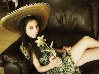
                                                  I really like this picture, I like Sophie's connection through the audience through her upward gaze and the use of the flower. However, I do not think the flower is clear enough and I regret not taking a photograph without the sombrero, as although it connotates her Hispanic style of music, I feel that she could look more mainstream and like an artist if she was not wearing it. Nonetheless, it is a potential front cover photo.


                                                  This photo is similar to the last one, but Sophie is sitting casually in a chair. I like this photo and am considering using it for the contents page. However, it is too similar to the other photo to use one for the contents page and one for the front cover. I will probably use this photo for the contents page and take another photo for the front cover.


                                                  I took this picture in a loft conversion, utilizing the cream wall to make Sophie stand out against the background, and not having a busy background. I really like this picture, especially Sophie's interaction with the audience through her unusual stare. This is definately a potential cover picture.


                                                  Although I like this picture, it has a "busier" background due to the cupboard and skylight window in the background. However , when I tried taking it from a different angle to avoid the busy background, the lighting was not as good. On the whole, I think I prefer the above image anyway in terms of Sophie's facial expression and posture.
                                                  This is a screenshot of just some of the photos I took- I took over 300 overall! Of course I could not upload all of them, so I had to do a major sort through of my photo collection.

                                                  Tuesday, 5 January 2010

                                                  Plans of Front Cover and Contents Page

                                                  I have drawn plans of my front page and contents.


                                                  Front Cover


                                                  Draft One of my Front Cover:


                                                  I first drew my front cover out like this, but it looked too crowded. So I decided to move the "Latino Loca" cover line and get rid of the text box which I had planned to surround some text. I also planned to move the headline left and shrink it a bit as I could not fit the whole title in!


                                                  Draft Two of my Front Cover:


                                                  I edited the front cover, but decided it still looked a bit crowded. Therefore, I decided to move the picture to the right and the cover lines to the left; this meant that I could have the cover lines down the left hand side and there could be less of them, meaning it would be less crowded. I could also enlarge the picture, which would reach out to the reader more.

                                                  Final Draft of Front Cover:


                                                  This is the final draft of my front cover. I definatley prefer the picture being on the left, and now have a clear idea how my photos and cover lines are going to fit together.


                                                  Contents Page

                                                  I found this alot easier to plan than the front cover, and was satisfied with my first draft.


                                                  I first wanted to have the picture on the left hand side, however, I altered this with the change of my front cover as it looked too simalar. I decided to put a picture in a circle in the middle so I can use text wrapping for each section of the contents. I decided to put a picture of my headphones on the right of the picture as it connotates music further.

                                                  I now feel much more confident about producing my front cover and contents page.